Nicholas Rizzo

Projects
About
Digital Menus
ValuesMatter
Freeway OS
Contact

Resume
Let’s cut to the chase.
I'm a designer with a robust skillset in UX, graphic design, and product management. Let’s create something incredible together!
Donuts & Design
Digital Menus for Crazy Glazed
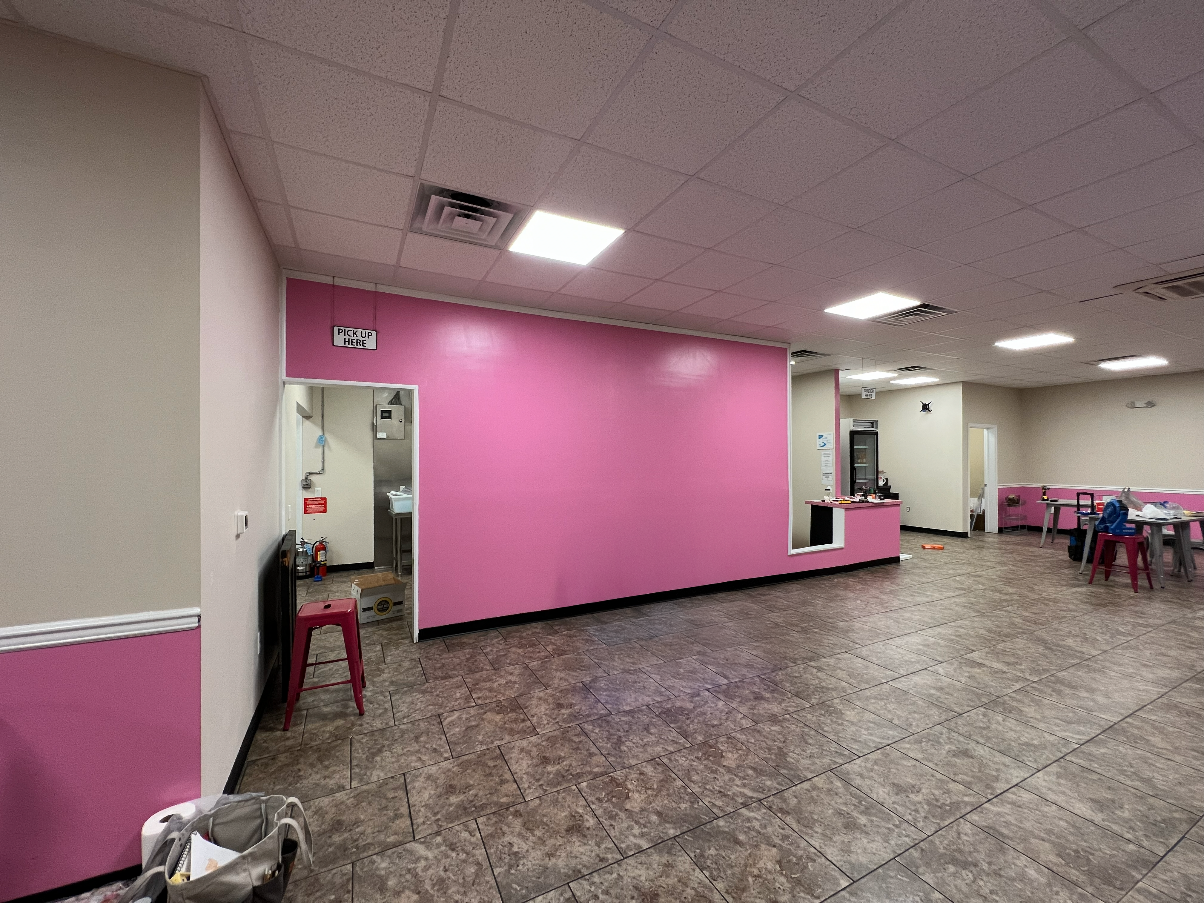
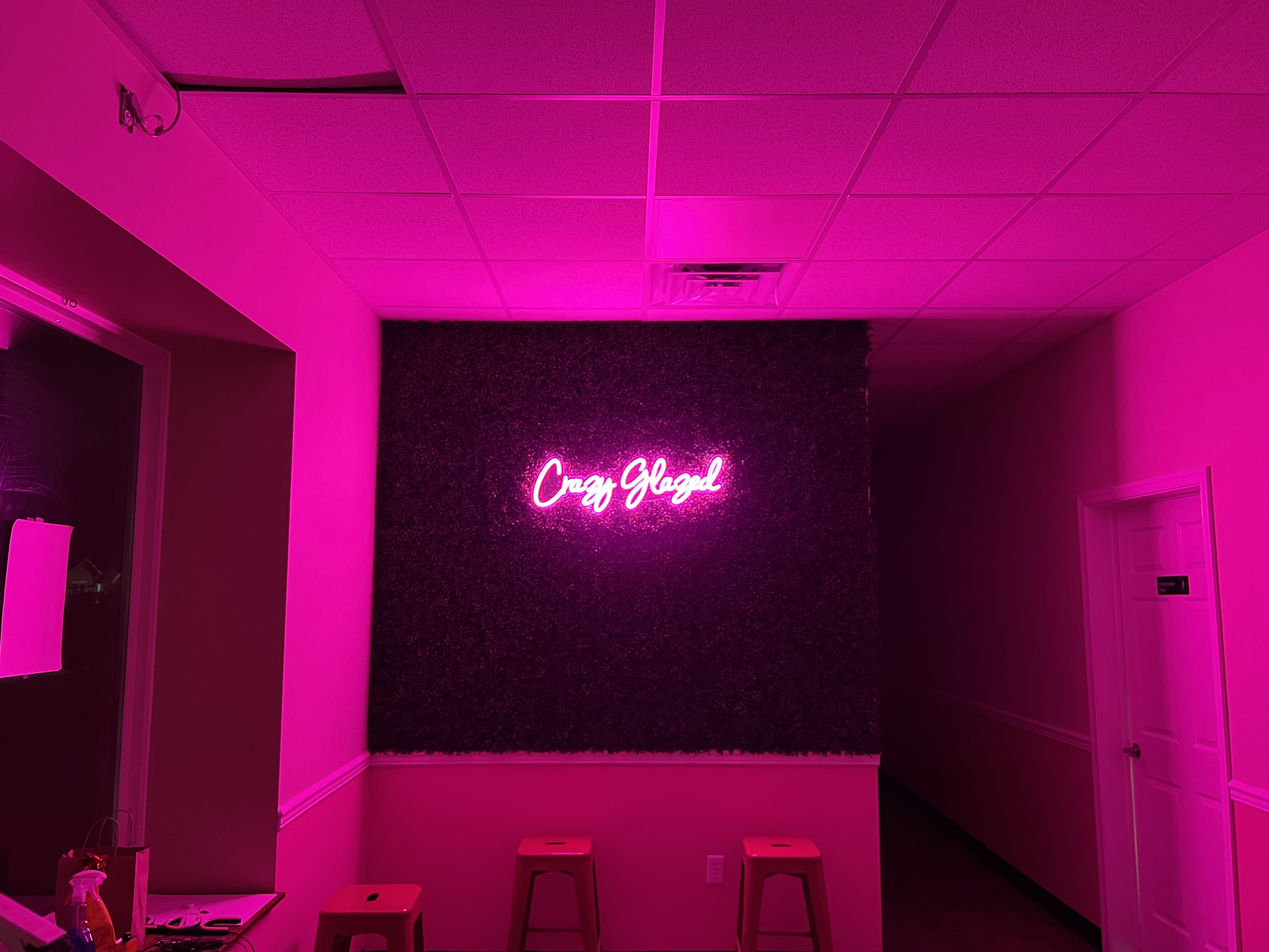
I stumbled into my first UX job about as organically as it gets: working behind the counter at a donut shop in high school. It was a made-to-order place, where donuts would be fried, iced, decorated, and handed to the customer in a matter of minutes. The system was designed with capacity in mind. If a customer could make it from the front door to the pickup window without slowing down, theoretically, there wouldn’t be a ceiling on our business.
This worked great, except at the register. Orders we thought would take a few seconds, “three chocolates, one with sprinkles, and a large coffee to go,” were taking much longer to get across. This bottlenecked our assembly line, sending lines out the door while the kitchen slowed to a crawl.
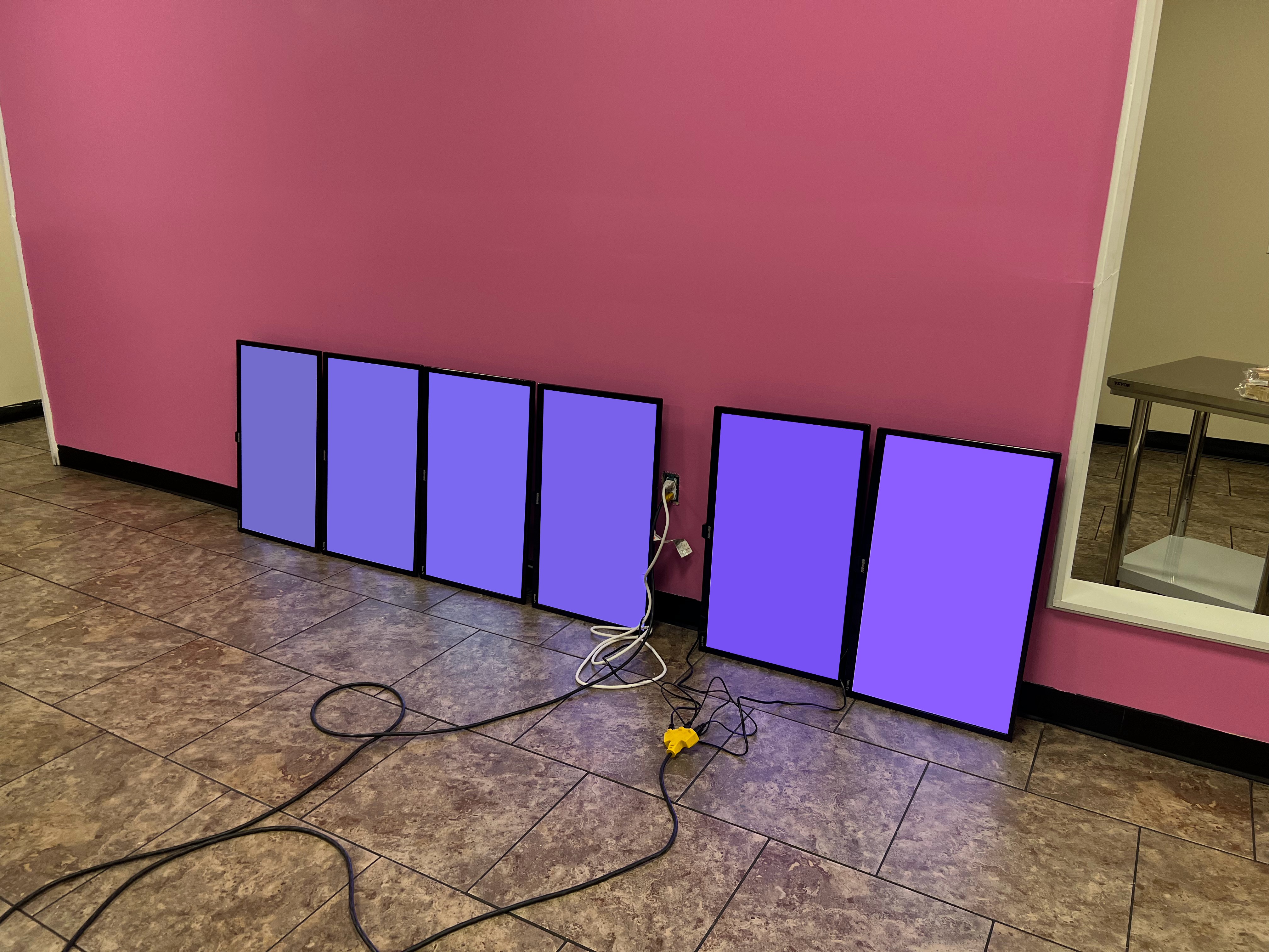
The problem? Customers didn’t understand the menu before their turn to order. Despite being shown on large screens in the dining room, our items and their respective options weren’t clear enough to the average passerby. It was clear something needed to change, and I went to work.
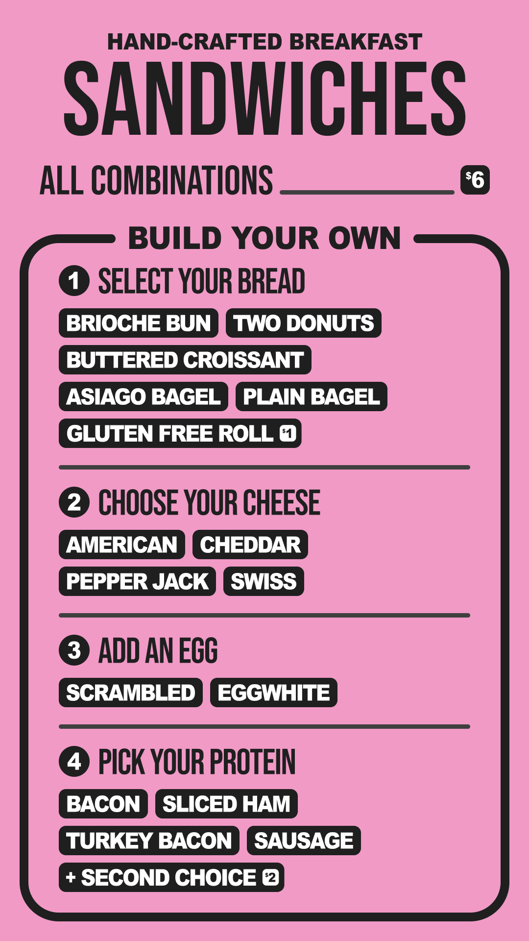
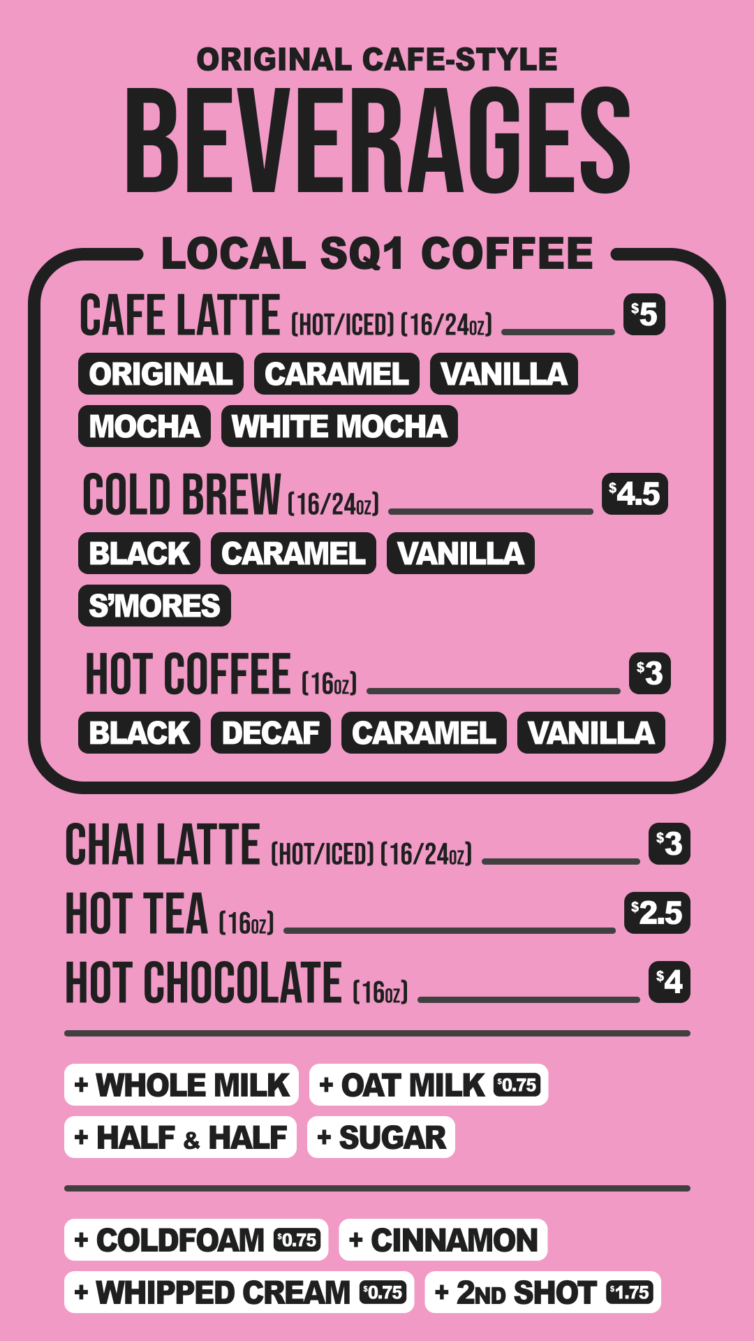
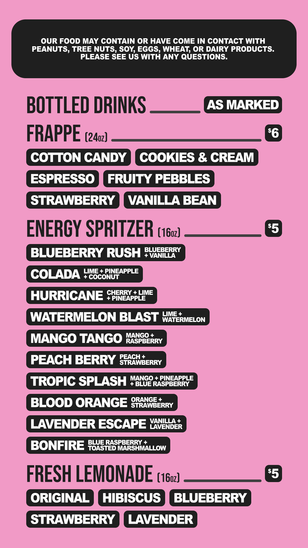
The first thing I did was deconstruct the menu. Donuts had various toppings, coffee had different varieties, and even the bottled water came in different sizes. If viewed in terms of uniqueness, we had hundreds of products to offer. My first challenge was apparent: group the products in a way that made sense.
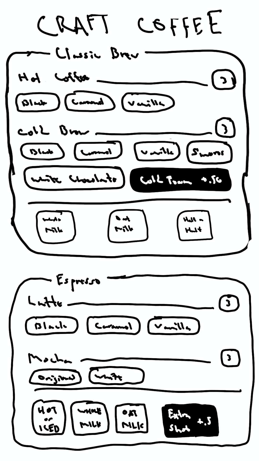
I decided that, except for the donuts themselves, menu items would be classified by their most basic form. We wouldn’t list “caramel half-calf oat milk breve with an extra shot and cinnamon”, but rather list “latte” and let the options follow as possible selections.
The next step was communicating the choices customers could make for each product. Some were mutually exclusive, like “large or small,” while others could compound, such as “vanilla and/or chocolate.” Still other sets could be optional, for example, “add whipped cream,” but often carried supplemental information, such as upcharges or mandatory disclosures.
Assigning visual cues to each of the above criteria, I created a chip-based system that could fully describe an item while saving space on the page. Relying on icons and colors to distinguish different choices intuitively guided customers down the menu, instead of overloading them with information.
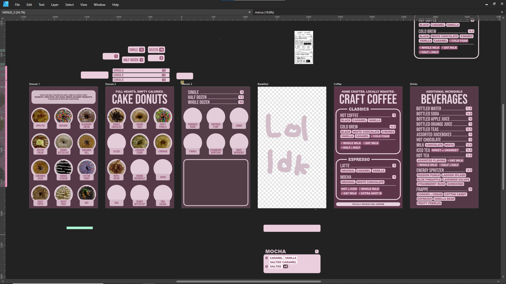
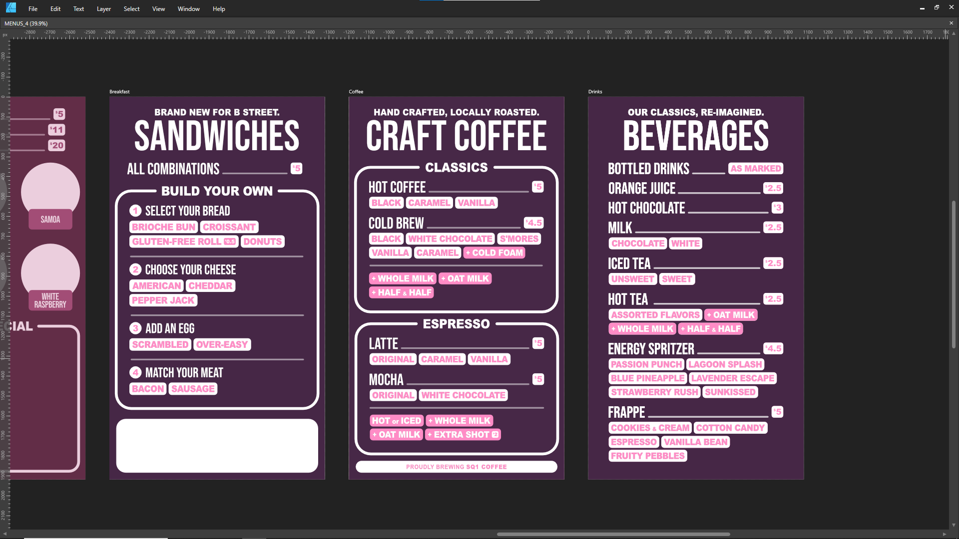
I now had a system that worked for the customer, but I needed it to work for the staff as well. Our employees were bakers, not design professionals, and the menus had to be changeable at the touch of a button. Products sold out, prices updated, and flavors came and went. The final task was to make the new menus dependable.
Previously working in Affinity Designer, I decided to move the project into Figma. Its content-aware systems accelerated my workflow, automating repetitive tasks such as padding and whitespace management.
Its reusable color and text styles also became essential, shortening my editing time exponentially.
Architecting each menu with Figma’s Auto Layout made it possible to export the final designs as HTML and CSS. This meant we could host the menus as auto-updating, infinitely customizable websites, and adjust them in the future as opportunities arose.
After months of preparation, we updated the menus one Saturday morning. Our regulars took some getting used to, but the bottlenecks in our assembly line quickly started to level out. Transactions sped up, lines evaporated, and our team got through crowds much faster than before.
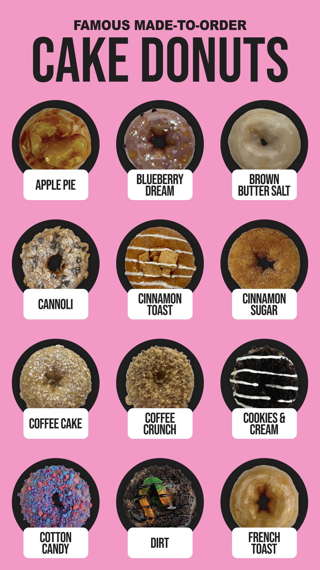
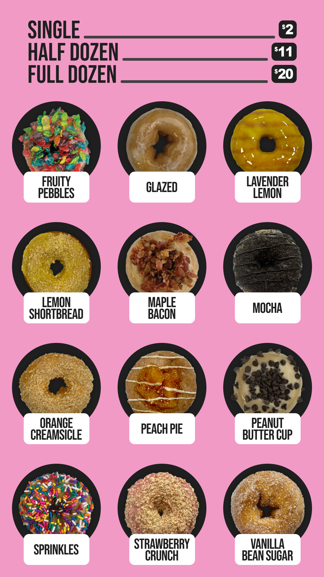
Though it was simple, I credit this project for my original interest in UX. My aptitude as a quick-learning problem solver drove me to build a product that soon became a vital business solution. My experiences at the donut shop taught me that by studying human behavior, I could optimize the world around me. This breakthrough has powered my career to this day.
Recognize, Reward, Repeat
ValuesMatter for enGen
Leveraging a background in traditional design, I began my UX career as an intern at enGen, a health tech leader with over 10,000 employees. At this scale, HR tools are just as critical as customer platforms. As such, my primary focus was modernizing ValuesMatter, the company’s employee recognition program. This tool allows team members to send “values” to one another, acting as both a token of appreciation and a nomination for company-wide awards.
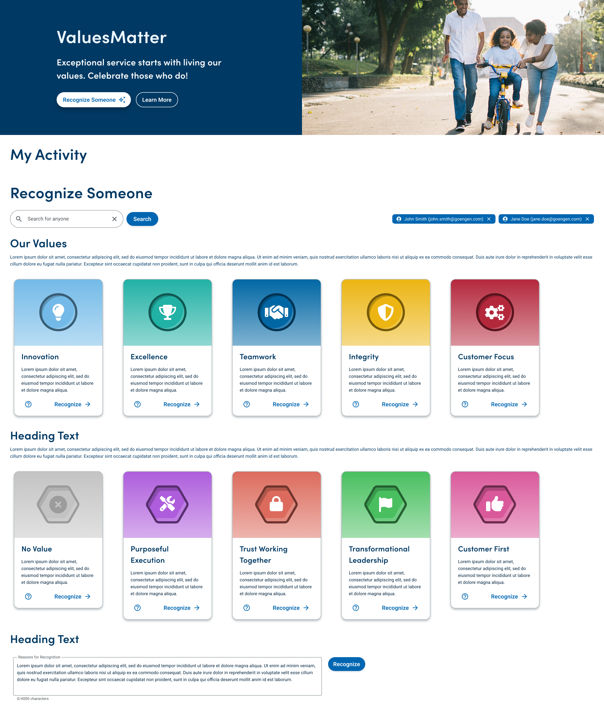
While the program’s core concept was simple, the interface suffered from an unintuitive and dated UI. To begin the refresh, our team conducted preliminary user testing on the existing interface. We held extensive interviews and gave asynchronous surveys via UserZoom, gathering user data that was both qualitative and quantitative. These insights provided a clear roadmap for improving the user journey and visual design going forward.
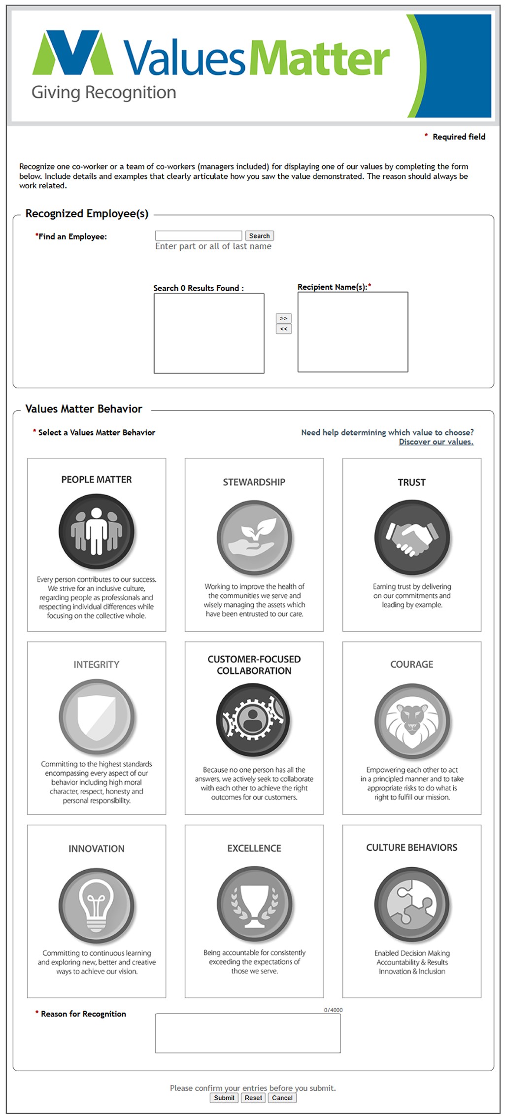
This banner is dated, and the page has no options for internal navigation.
The search box is easily missed and selecting results
is very convoluted.
These descriptions are nice, but nobody realizes these are also required buttons.
Our surveys revealed that the multi-step search feature was a significant pain point, often causing unnecessary confusion. Interviewees also suggested that, while individual recognitions were standard, an ability to recognize teams would be helpful. These findings highlighted a need for a more streamlined, versatile page layout.
Furthermore, preliminary testing found the information regarding specific "values" to be insufficient. It was often difficult to distinguish between categories or determine which was most applicable to a specific scenario. We realized that by providing more context and clearer descriptions, we could increase user understanding while balancing simplicity.
This feedback was vital and helped shape my understanding of our users’ challenges in ways I otherwise could not have achieved. As I completed my first series of drafts, it helped guide my priorities throughout the design process and continuously aligned the product to the needs of those it was for.
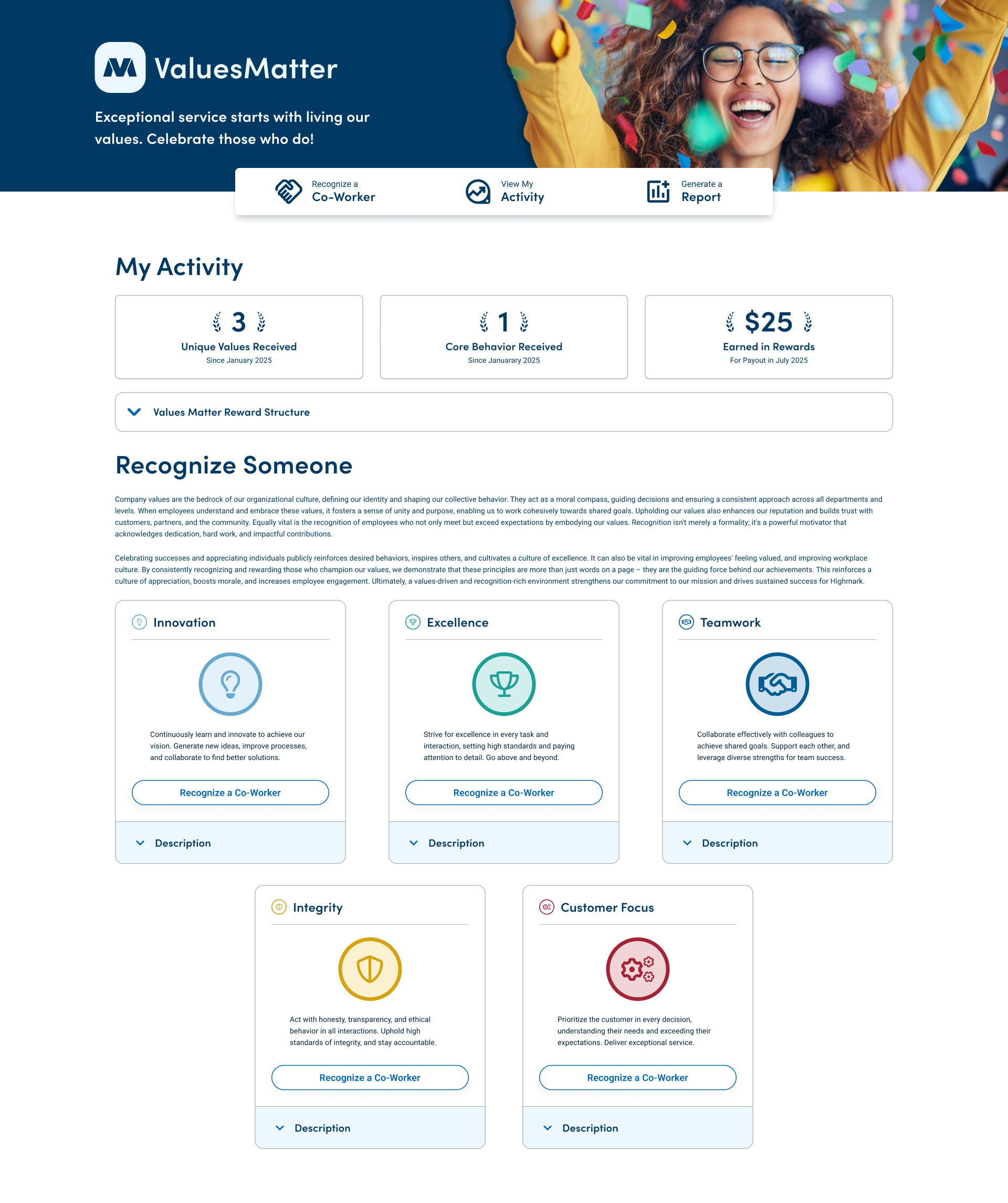
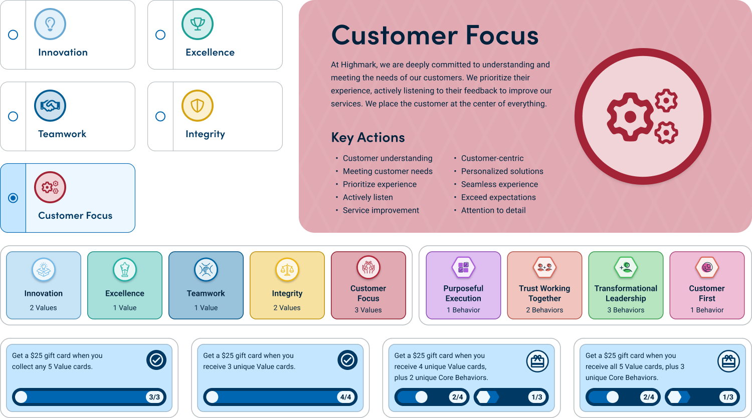
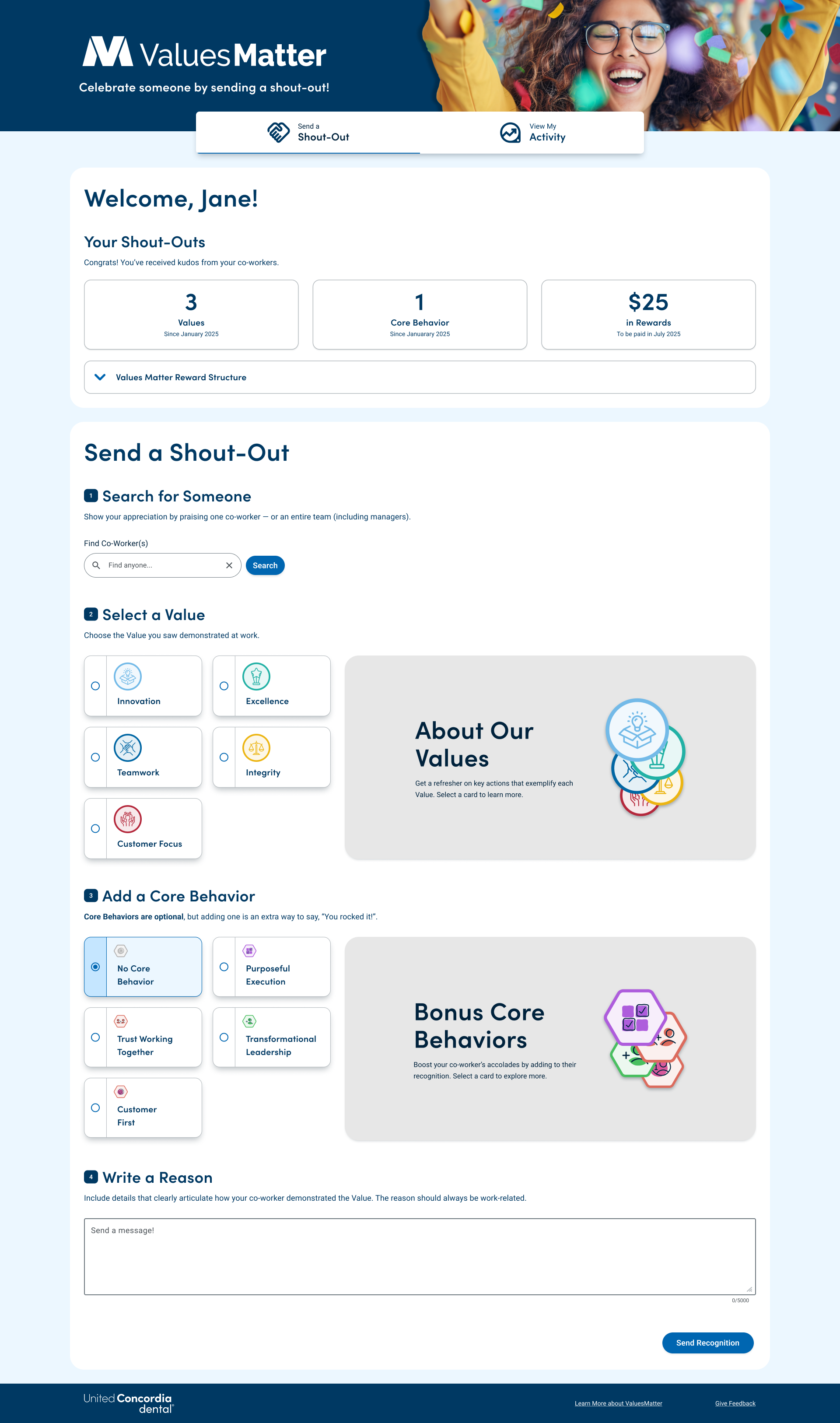
This project significantly sharpened my skills in data visualization, as I embraced the "show, don't tell" philosophy. I focused on developing components that balanced cognitive load and information density, ensuring that users felt informed without being overwhelmed by the interface.
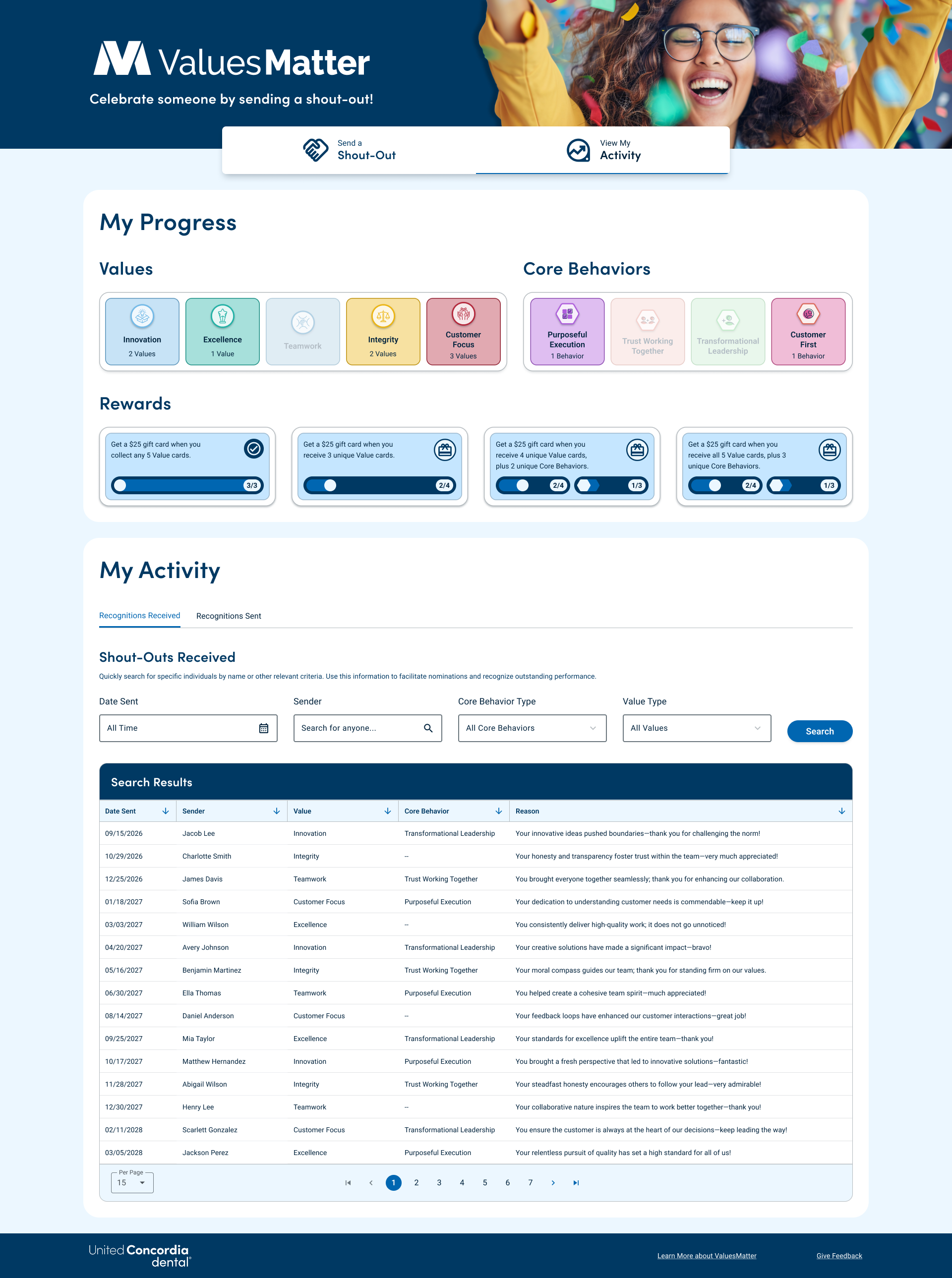
One key solution was a custom multiple-choice component that allowed users to see additional context for the selected item, which greatly simplified the recognition process. Additionally, I designed an activity page using colorful visual indicators to provide clear status updates at a glance. These design choices were validated by our final round of testing, which showed a marked improvement in user confidence and task completion speeds compared to the original version.
This experience reinforced the importance I put on iterative testing and the power of collaborative design. Working alongside a talented team taught me how to combine diverse perspectives into a cohesive product. I am incredibly proud of the final result, which received high praise from both stakeholders and users. While my earlier work taught me the fundamentals of design, this project taught me how to lead and collaborate within a professional UX environment.
Simpler Systems, Smarter Streets
Freeway OS at Penn State University
Entering my third year of university, I wanted to push my UX skills beyond standard web design. In an application design studio, my team and I challenged ourselves to build a vehicle interface with a major twist: it had to be navigated entirely through physical inputs rather than a touchscreen.
Drawing on my previous work in data visualization, I started with some modular “bento-box” layouts. However, I quickly realized that my usual design instincts were clashing with our most important constraint: driver safety. In UX, designers are usually trying to capture a user's attention; in a car, that attention belongs on the road. This project forced us to rethink everything we knew, focusing on “unconscious usability” to keep the driver focused.
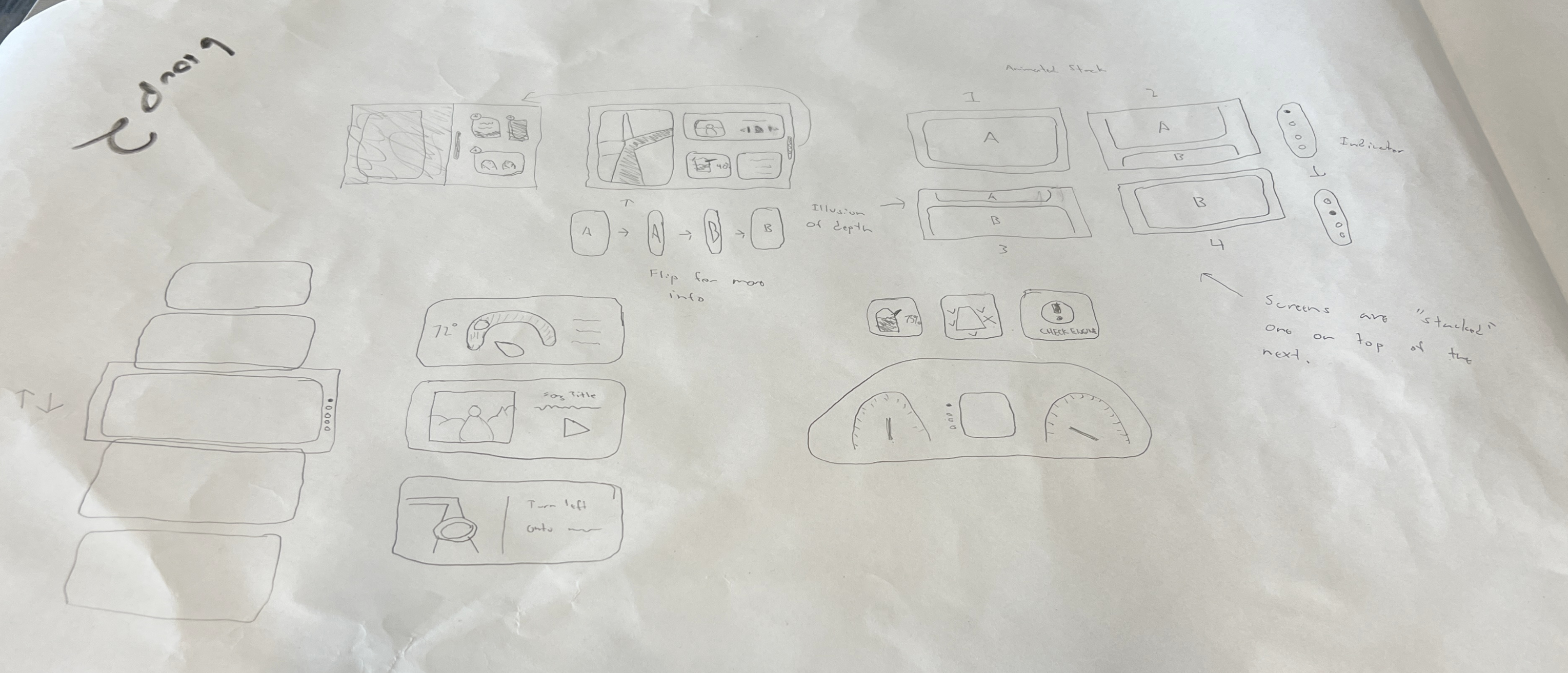
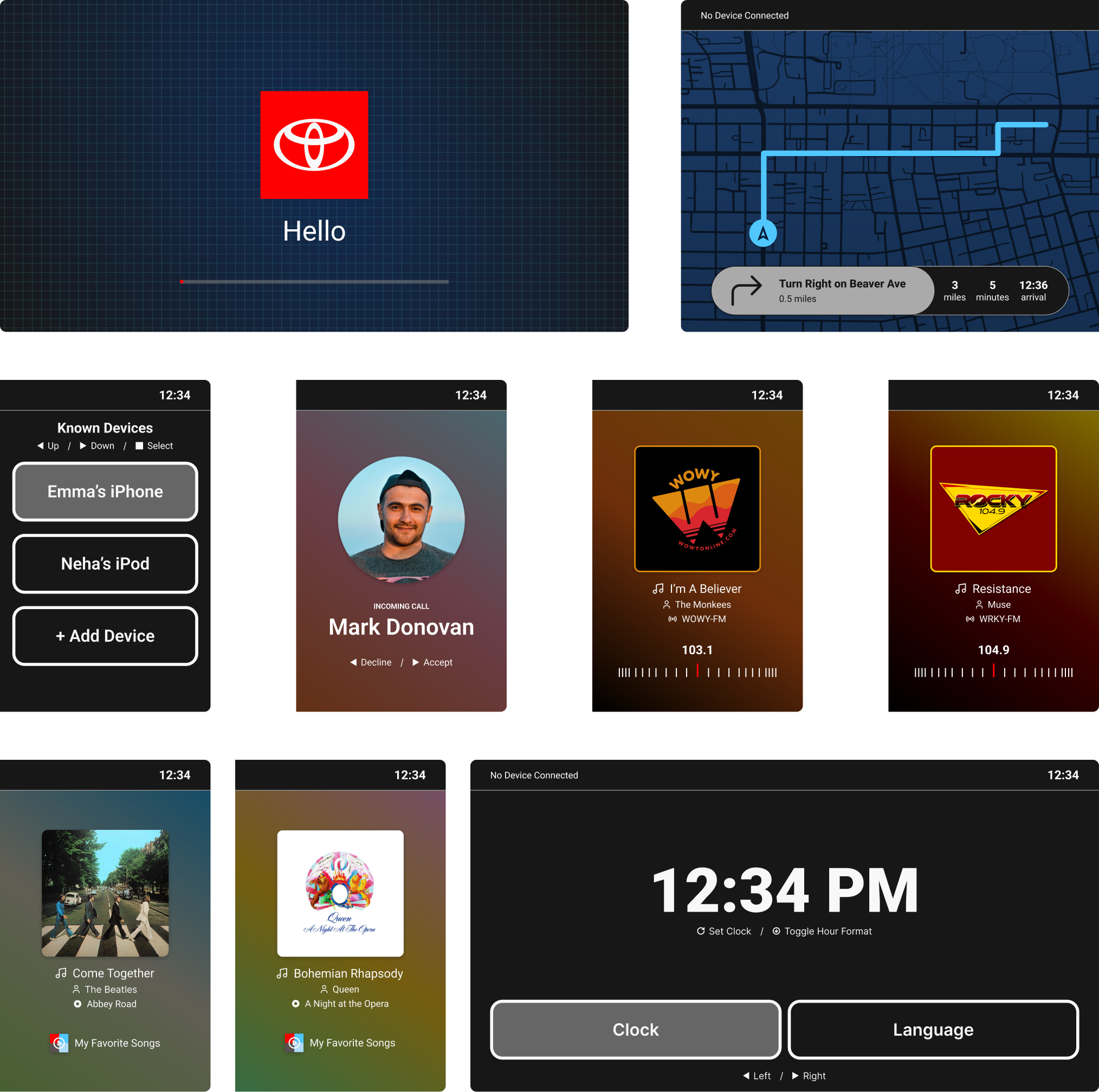
With this in mind, we began rethinking how our design would play out. We laid out screens that were simple and easy to look at, in an effort to minimize cognitive load. Just as well, we limited navigation to two methods per app, as this would let us use standard “next” and “back” buttons within our flows. Our first prototype proved to be quite intuitive, which was a great sign moving forward.
We landed on a decently conventional system of physical controls. A central bar would allow the user to connect a Bluetooth device, access the main menu, and go to the application’s native settings page. Audio would be controlled by a traditional set of volume and radio dials, as well as a back, forward, and play/pause button, each providing a navigation and selection function as well. We also implemented several climate controls that, while non-functional, improved the program’s realism.
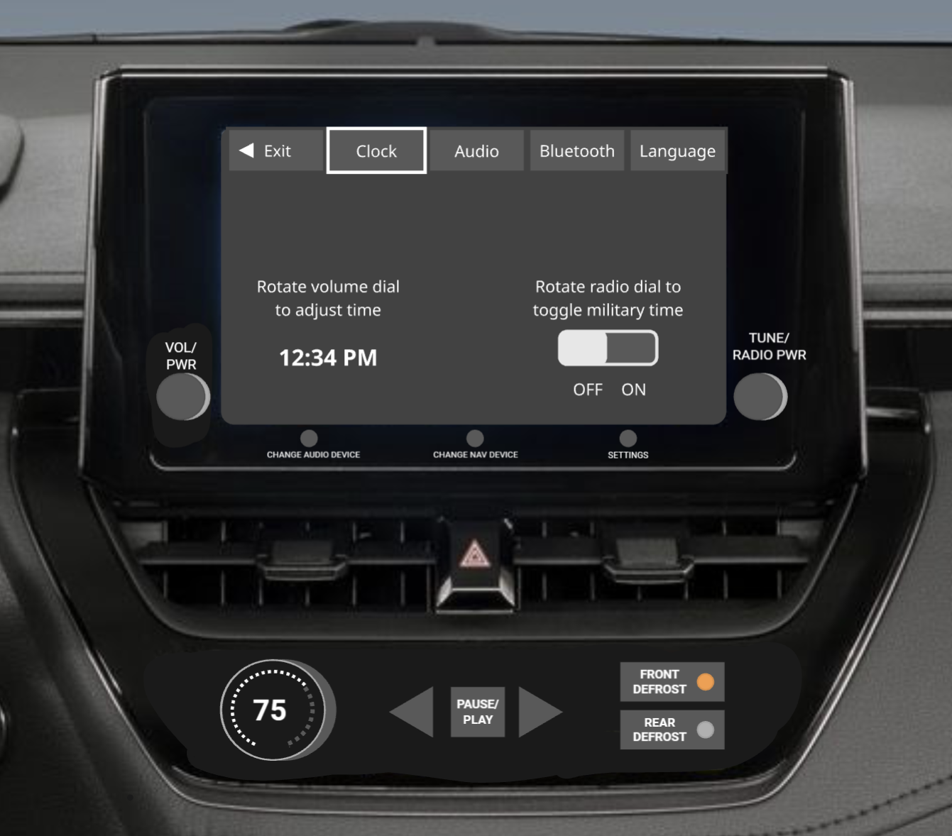
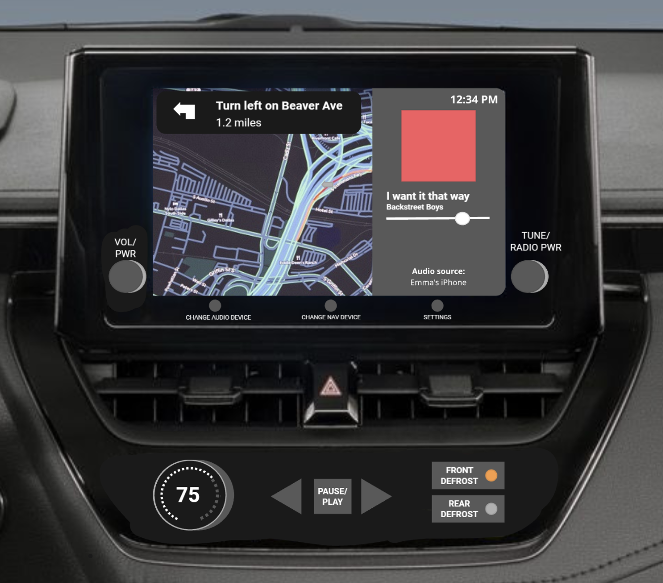
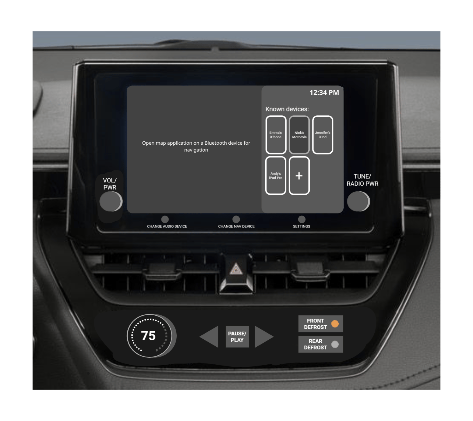
The most challenging part of our prototyping process was making each functionality possible in Figma. Each screen was set up as a component variant tied to a variable string. As a button on the “dashboard” was clicked, a set of “conditional” handlers would analyze the user’s position in the application before updating the visuals accordingly. This system allowed our limited set of controls to have multiple purposes, and meant our users could conventionally explore the application. It is easily the most advanced prototype I have ever built, allowing for a high-fidelity experience that felt like a finished product.
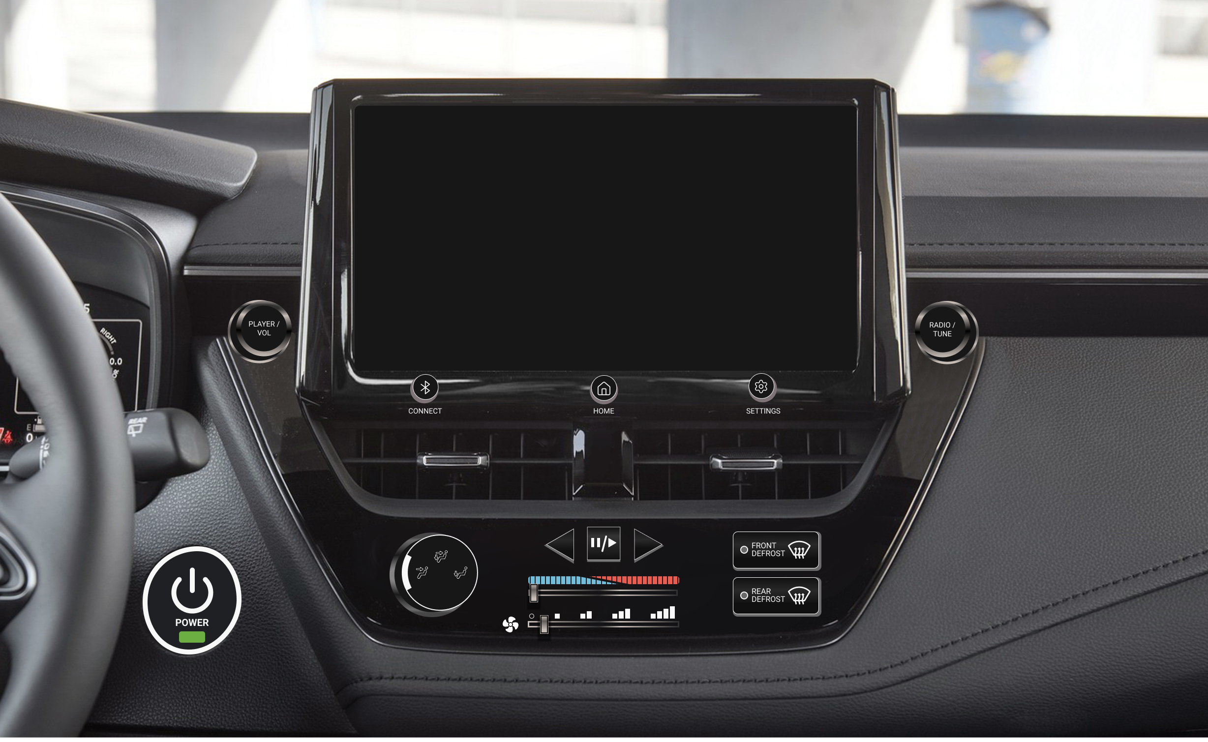
The final UI was built on high contrast and a limited color palette to ensure everything was readable at a glance, regardless of lighting. This project was an incredible lesson in problem-solving and adaptability. It pushed me to think about accessibility in a high-stakes environment and taught me how to manage a complex product from start to finish. I walked away not just with a stronger technical toolkit, but with a much deeper understanding of how to design for the real world.
Made it to the end? Let’s work together!
© Nicholas Rizzo 2026

Let’s cut to the chase.
I'm a designer with a robust skillset in UX, graphic design, and product management.
Let’s create something incredible together!
Donuts & Design
Digital Menus for Crazy Glazed
I stumbled into my first UX job about as organically as it gets: working behind the counter at a donut shop in high school. It was a made-to-order place, where donuts would be fried, iced, decorated, and handed to the customer in a matter of minutes. The system was designed with capacity in mind. If a customer could make it from the front door to the pickup window without slowing down, theoretically, there wouldn’t be a ceiling on our business.
This worked great, except at the register. Orders we thought would take a few seconds, “three chocolates, one with sprinkles, and a large coffee to go,” were taking much longer to get across. This bottlenecked our assembly line, sending lines out the door while the kitchen slowed to a crawl.
The problem? Customers didn’t understand the menu before their turn to order. Despite being shown on large screens in the dining room, our items and their respective options weren’t clear enough to the average passerby. It was clear something needed to change, and I went to work.
The first thing I did was deconstruct the menu. Donuts had various toppings, coffee had different varieties, and even the bottled water came in different sizes. If viewed in terms of uniqueness, we had hundreds of products to offer. My first challenge was apparent: group the products in a way that made sense.
I decided that, except for the donuts themselves, menu items would be classified by their most basic form. We wouldn’t list “caramel half-calf oat milk breve with an extra shot and cinnamon”, but rather list “latte” and let the options follow as possible selections.
The next step was communicating the choices customers could make for each product. Some were mutually exclusive, like “large or small,” while others could compound, such as “vanilla and/or chocolate.” Still other sets could be optional, for example, “add whipped cream,” but often carried supplemental information, such as upcharges or mandatory disclosures.
Assigning visual cues to each of the above criteria, I created a chip-based system that could fully describe an item while saving space on the page. Relying on icons and colors to distinguish different choices intuitively guided customers down the menu, instead of overloading them with information.
I now had a system that worked for the customer, but I needed it to work for the staff as well. Our employees were bakers, not design professionals, and the menus had to be changeable at the touch of a button. Products sold out, prices updated, and flavors came and went. The final task was to make the new menus dependable.
Previously working in Affinity Designer, I decided to move the project into Figma. Its content-aware systems accelerated my workflow, automating repetitive tasks such as padding and whitespace management.
Its reusable color and text styles also became essential, shortening my editing time exponentially.
Architecting each menu with Figma’s Auto Layout made it possible to export the final designs as HTML and CSS. This meant we could host the menus as auto-updating, infinitely customizable websites, and adjust them in the future as opportunities arose.
After months of preparation, we updated the menus one Saturday morning. Our regulars took some getting used to, but the bottlenecks in our assembly line quickly started to level out. Transactions sped up, lines evaporated, and our team got through crowds much faster than before.
Though it was simple, I credit this project for my original interest in UX. My aptitude as a quick-learning problem solver drove me to build a product that soon became a vital business solution. My experiences at the donut shop taught me that by studying human behavior, I could optimize the world around me. This breakthrough has powered my career to this day.
Recognize, Reward, Repeat
ValuesMatter for enGen
Leveraging a background in traditional design, I began my UX career as an intern at enGen, a health tech leader with over 10,000 employees. At this scale, HR tools are just as critical as customer platforms. As such, my primary focus was modernizing ValuesMatter, the company’s employee recognition program. This tool allows team members to send “values” to one another, acting as both a token of appreciation and a nomination for company-wide awards.
While the program’s core concept was simple, the interface suffered from an unintuitive and dated UI. To begin the refresh, our team conducted preliminary user testing on the existing interface. We held extensive interviews and gave asynchronous surveys via UserZoom, gathering user data that was both qualitative and quantitative. These insights provided a clear roadmap for improving the user journey and visual design going forward.
The search box is easily missed and selecting results is very convoluted.
This description box
is often overlooked.
This banner is dated, and
the page has no options for internal navigation.
These descriptions are nice, but nobody realizes these are also required buttons.
Our surveys revealed that the multi-step search feature was a significant pain point, often causing unnecessary confusion. Interviewees also suggested that, while individual recognitions were standard, an ability to recognize teams would be helpful. These findings highlighted a need for a more streamlined, versatile page layout.
Furthermore, preliminary testing found the information regarding specific "values" to be insufficient. It was often difficult to distinguish between categories or determine which was most applicable to a specific scenario. We realized that by providing more context and clearer descriptions, we could increase user understanding while balancing simplicity.
This feedback was vital and helped shape my understanding of our users’ challenges in ways I otherwise could not have achieved. As I completed my first series of drafts, it helped guide my priorities throughout the design process and continuously aligned the product to the needs of those it was for.
This project significantly sharpened my skills in data visualization, as I embraced the "show, don't tell" philosophy. I focused on developing components that balanced cognitive load and information density, ensuring that users felt informed without being overwhelmed by the interface.
One key solution was a custom multiple-choice component that allowed users to see additional context for the selected item, which greatly simplified the recognition process. Additionally, I designed an activity page using colorful visual indicators to provide clear status updates at a glance. These design choices were validated by our final round of testing, which showed a marked improvement in user confidence and task completion speeds compared to the original version.
This experience reinforced the importance I put on iterative testing and the power of collaborative design. Working alongside a talented team taught me how to combine diverse perspectives into a cohesive product. I am incredibly proud of the final result, which received high praise from both stakeholders and users. While my earlier work taught me the fundamentals of design, this project taught me how to lead and collaborate within a professional UX environment.
Simpler Systems, Smarter Streets
Freeway OS at Penn State University
Entering my third year of university, I wanted to push my UX skills beyond standard web design. In an application design studio, my team and I challenged ourselves to build a vehicle interface with a major twist: it had to be navigated entirely through physical inputs rather than a touchscreen.
Drawing on my previous work in data visualization, I started with some modular “bento-box” layouts. However, I quickly realized that my usual design instincts were clashing with our most important constraint: driver safety. In UX, designers are usually trying to capture a user's attention; in a car, that attention belongs on the road. This project forced us to rethink everything we knew, focusing on “unconscious usability” to keep the driver focused.
With this in mind, we began rethinking how our design would play out. We laid out screens that were simple and easy to look at, in an effort to minimize cognitive load. Just as well, we limited navigation to two methods per app, as this would let us use standard “next” and “back” buttons within our flows. Our first prototype proved to be quite intuitive, which was a great sign moving forward.
We landed on a decently conventional system of physical controls. A central bar would allow the user to connect a Bluetooth device, access the main menu, and go to the application’s native settings page. Audio would be controlled by a traditional set of volume and radio dials, as well as a back, forward, and play/pause button, each providing a navigation and selection function as well. We also implemented several climate controls that, while non-functional, improved the program’s realism.
The most challenging part of our prototyping process was making each functionality possible in Figma. Each screen was set up as a component variant tied to a variable string. As a button on the “dashboard” was clicked, a set of “conditional” handlers would analyze the user’s position in the application before updating the visuals accordingly. This system allowed our limited set of controls to have multiple purposes, and meant our users could conventionally explore the application. It is easily the most advanced prototype I have ever built, allowing for a high-fidelity experience that felt like a finished product.
The final UI was built on high contrast and a limited color palette to ensure everything was readable at a glance, regardless of lighting. This project was an incredible lesson in problem-solving and adaptability. It pushed me to think about accessibility in a high-stakes environment and taught me how to manage a complex product from start to finish. I walked away not just with a stronger technical toolkit, but with a much deeper understanding of how to design for the real world.
Made it to the end? Let’s work together!
© Nicholas Rizzo 2026
Let’s cut to the chase.
I'm a designer with a robust skillset in UX, graphic design, and product management.
Let’s create something incredible together!
Donuts & Design
Digital Menus for Crazy Glazed
I stumbled into my first UX job about as organically as it gets: working behind the counter at a donut shop in high school. It was a made-to-order place, where donuts would be fried, iced, decorated, and handed to the customer in a matter of minutes. The system was designed with capacity in mind. If a customer could make it from the front door to the pickup window without slowing down, theoretically, there wouldn’t be a ceiling on our business.
This worked great, except at the register. Orders we thought would take a few seconds, “three chocolates, one with sprinkles, and a large coffee to go,” were taking much longer to get across. This bottlenecked our assembly line, sending lines out the door while the kitchen slowed to a crawl.
The problem? Customers didn’t understand the menu before their turn to order. Despite being shown on large screens in the dining room, our items and their respective options weren’t clear enough to the average passerby. It was clear something needed to change, and I went to work.
The first thing I did was deconstruct the menu. Donuts had various toppings, coffee had different varieties, and even the bottled water came in different sizes. If viewed in terms of uniqueness, we had hundreds of products to offer. My first challenge was apparent: group the products in a way that made sense.
I decided that, except for the donuts themselves, menu items would be classified by their most basic form. We wouldn’t list “caramel half-calf oat milk breve with an extra shot and cinnamon”, but rather list “latte” and let the options follow as possible selections.
The next step was communicating the choices customers could make for each product. Some were mutually exclusive, like “large or small,” while others could compound, such as “vanilla and/or chocolate.” Still other sets could be optional, for example, “add whipped cream,” but often carried supplemental information, such as upcharges or mandatory disclosures.
Assigning visual cues to each of the above criteria, I created a chip-based system that could fully describe an item while saving space on the page. Relying on icons and colors to distinguish different choices intuitively guided customers down the menu, instead of overloading them with information.
I now had a system that worked for the customer, but I needed it to work for the staff as well. Our employees were bakers, not design professionals, and the menus had to be changeable at the touch of a button. Products sold out, prices updated, and flavors came and went. The final task was to make the new menus dependable.
Previously working in Affinity Designer, I decided to move the project into Figma. Its content-aware systems accelerated my workflow, automating repetitive tasks such as padding and whitespace management.
Its reusable color and text styles also became essential, shortening my editing time exponentially.
Architecting each menu with Figma’s Auto Layout made it possible to export the final designs as HTML and CSS. This meant we could host the menus as auto-updating, infinitely customizable websites, and adjust them in the future as opportunities arose.
After months of preparation, we updated the menus one Saturday morning. Our regulars took some getting used to, but the bottlenecks in our assembly line quickly started to level out. Transactions sped up, lines evaporated, and our team got through crowds much faster than before.
Though it was simple, I credit this project for my original interest in UX. My aptitude as a quick-learning problem solver drove me to build a product that soon became a vital business solution. My experiences at the donut shop taught me that by studying human behavior, I could optimize the world around me. This breakthrough has powered my career to this day.
Recognize, Reward, Repeat
ValuesMatter for enGen
Leveraging a background in traditional design, I began my UX career as an intern at enGen, a health tech leader with over 10,000 employees. At this scale, HR tools are just as critical as customer platforms. As such, my primary focus was modernizing ValuesMatter, the company’s employee recognition program. This tool allows team members to send “values” to one another, acting as both a token of appreciation and a nomination for company-wide awards.
While the program’s core concept was simple, the interface suffered from an unintuitive and dated UI. To begin the refresh, our team conducted preliminary user testing on the existing interface. We held extensive interviews and gave asynchronous surveys via UserZoom, gathering user data that was both qualitative and quantitative. These insights provided a clear roadmap for improving the user journey and visual design going forward.
The search box is easily
missed and selecting results
is very convoluted.
This description box
is often overlooked.
This banner is dated, and
the page has no options for internal navigation.
These descriptions are nice,
but nobody realizes these are also required buttons.
Our surveys revealed that the multi-step search feature was a significant pain point, often causing unnecessary confusion. Interviewees also suggested that, while individual recognitions were standard, an ability to recognize teams would be helpful. These findings highlighted a need for a more streamlined, versatile page layout.
Furthermore, preliminary testing found the information regarding specific "values" to be insufficient. It was often difficult to distinguish between categories or determine which was most applicable to a specific scenario. We realized that by providing more context and clearer descriptions, we could increase user understanding while balancing simplicity.
This feedback was vital and helped shape my understanding of our users’ challenges in ways I otherwise could not have achieved. As I completed my first series of drafts, it helped guide my priorities throughout the design process and continuously aligned the product to the needs of those it was for.
This project significantly sharpened my skills in data visualization, as I embraced the "show, don't tell" philosophy. I focused on developing components that balanced cognitive load and information density, ensuring that users felt informed without being overwhelmed by the interface.
One key solution was a custom multiple-choice component that allowed users to see additional context for the selected item, which greatly simplified the recognition process. Additionally, I designed an activity page using colorful visual indicators to provide clear status updates at a glance. These design choices were validated by our final round of testing, which showed a marked improvement in user confidence and task completion speeds compared to the original version.
This experience reinforced the importance I put on iterative testing and the power of collaborative design. Working alongside a talented team taught me how to combine diverse perspectives into a cohesive product. I am incredibly proud of the final result, which received high praise from both stakeholders and users. While my earlier work taught me the fundamentals of design, this project taught me how to lead and collaborate within a professional UX environment.
Simpler Systems, Smarter Streets
Freeway OS at Penn State University
Entering my third year of university, I wanted to push my UX skills beyond standard web design. In an application design studio, my team and I challenged ourselves to build a vehicle interface with a major twist: it had to be navigated entirely through physical inputs rather than a touchscreen.
Drawing on my previous work in data visualization, I started with some modular “bento-box” layouts. However, I quickly realized that my usual design instincts were clashing with our most important constraint: driver safety. In UX, designers are usually trying to capture a user's attention; in a car, that attention belongs on the road. This project forced us to rethink everything we knew, focusing on “unconscious usability” to keep the driver focused.
With this in mind, we began rethinking how our design would play out. We laid out screens that were simple and easy to look at, in an effort to minimize cognitive load. Just as well, we limited navigation to two methods per app, as this would let us use standard “next” and “back” buttons within our flows. Our first prototype proved to be quite intuitive, which was a great sign moving forward.
We landed on a decently conventional system of physical controls. A central bar would allow the user to connect a Bluetooth device, access the main menu, and go to the application’s native settings page. Audio would be controlled by a traditional set of volume and radio dials, as well as a back, forward, and play/pause button, each providing a navigation and selection function as well. We also implemented several climate controls that, while non-functional, improved the program’s realism.
The most challenging part of our prototyping process was making each functionality possible in Figma. Each screen was set up as a component variant tied to a variable string. As a button on the “dashboard” was clicked, a set of “conditional” handlers would analyze the user’s position in the application before updating the visuals accordingly. This system allowed our limited set of controls to have multiple purposes, and meant our users could conventionally explore the application. It is easily the most advanced prototype I have ever built, allowing for a high-fidelity experience that felt like a finished product.
The final UI was built on high contrast and a limited color palette to ensure everything was readable at a glance, regardless of lighting. This project was an incredible lesson in problem-solving and adaptability. It pushed me to think about accessibility in a high-stakes environment and taught me how to manage a complex product from start to finish. I walked away not just with a stronger technical toolkit, but with a much deeper understanding of how to design for the real world.
Made it to the end? Let’s work together!
© Nicholas Rizzo 2026